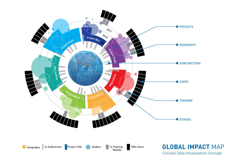
This data visualization concept was created for a multi-national client with offices across the globe. The client had many projects, user studies, training programs and subfunctions they needed to keep track of in one dynamic, interactive application; a Global Impact Map. It had to work as an animation in PPT presentations, flat in print, as well as an online application.
The variables required were; Geography, Projects, Studies, Training Modules, Subfunctions, Number of Users and how each flowed through Time. This conceptual Global Impact Map would have been completed in HTML5 for interactivity and to allow the data be be dynamically displayed in real-time online based on a user-updated database.

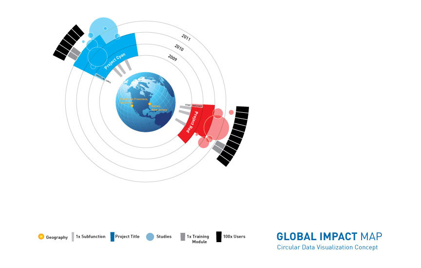
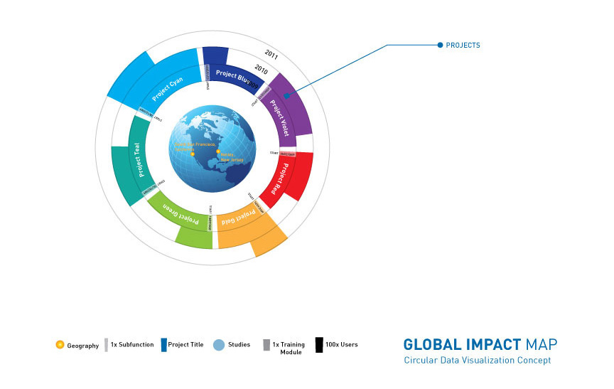
Two Projects View: shows the total impact of the Project, with number of users, number of and size of studies, subfunctions, and regions affected from start to current status. Projects were color coded, two examples presented below.
Variables are shown as individual elements broken out.
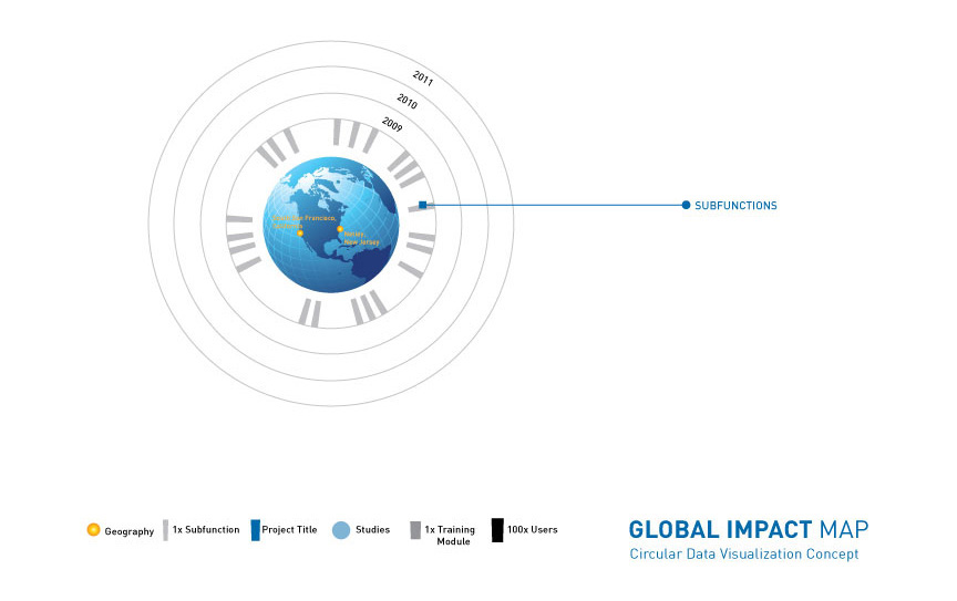
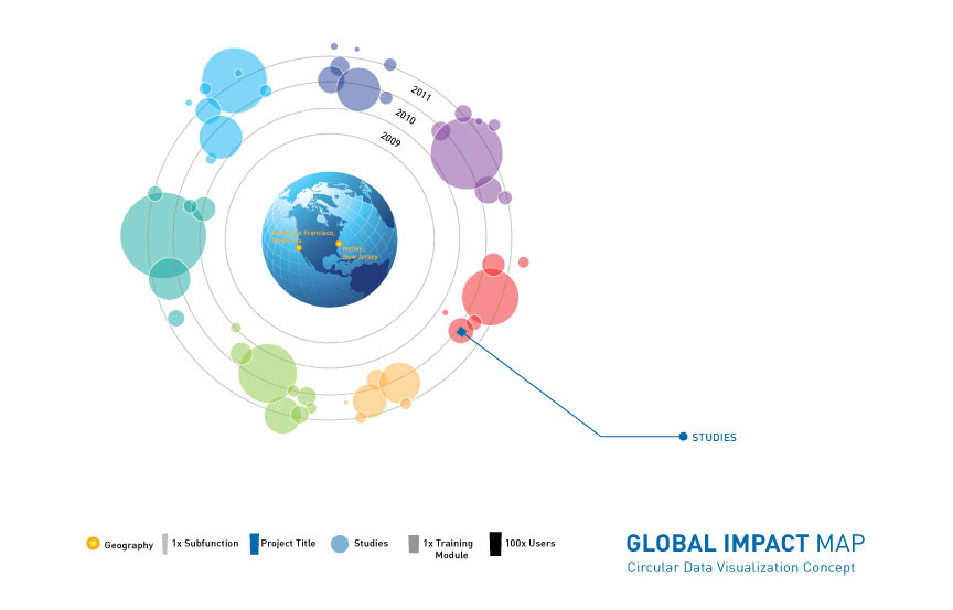
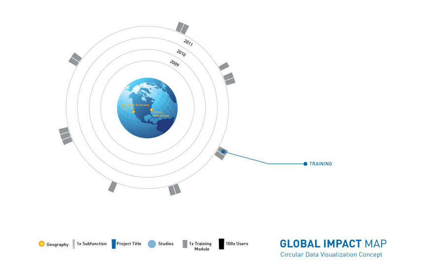
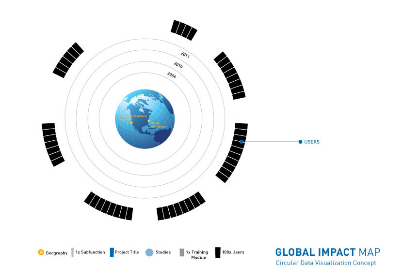
The globe spins to show the proper geography of the chosen Project, Training, or Study. If multiple regions are represented, the globe becomes transparent so that all regions are displayed.